Summer 2021 | Semester 6 | Illustrator, Glyphs
Font Design Reblust
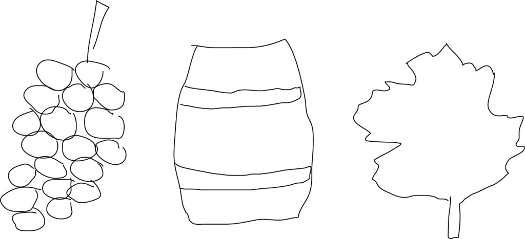
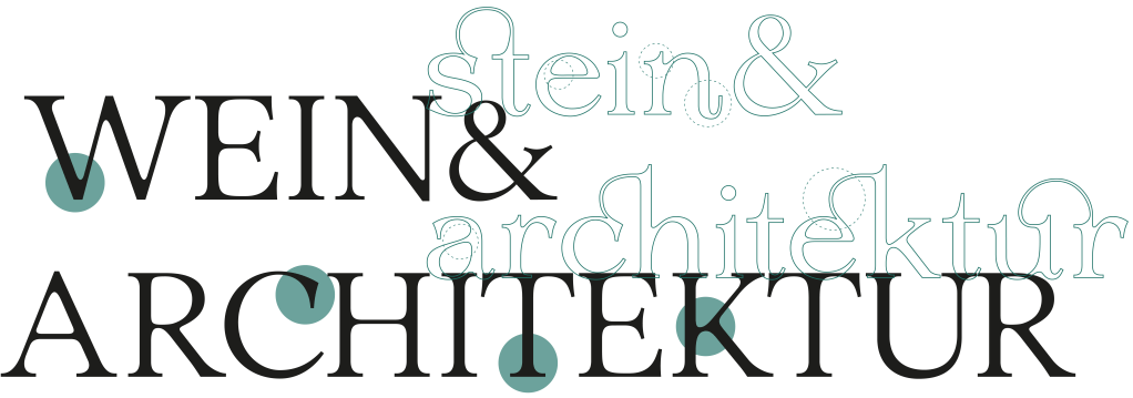
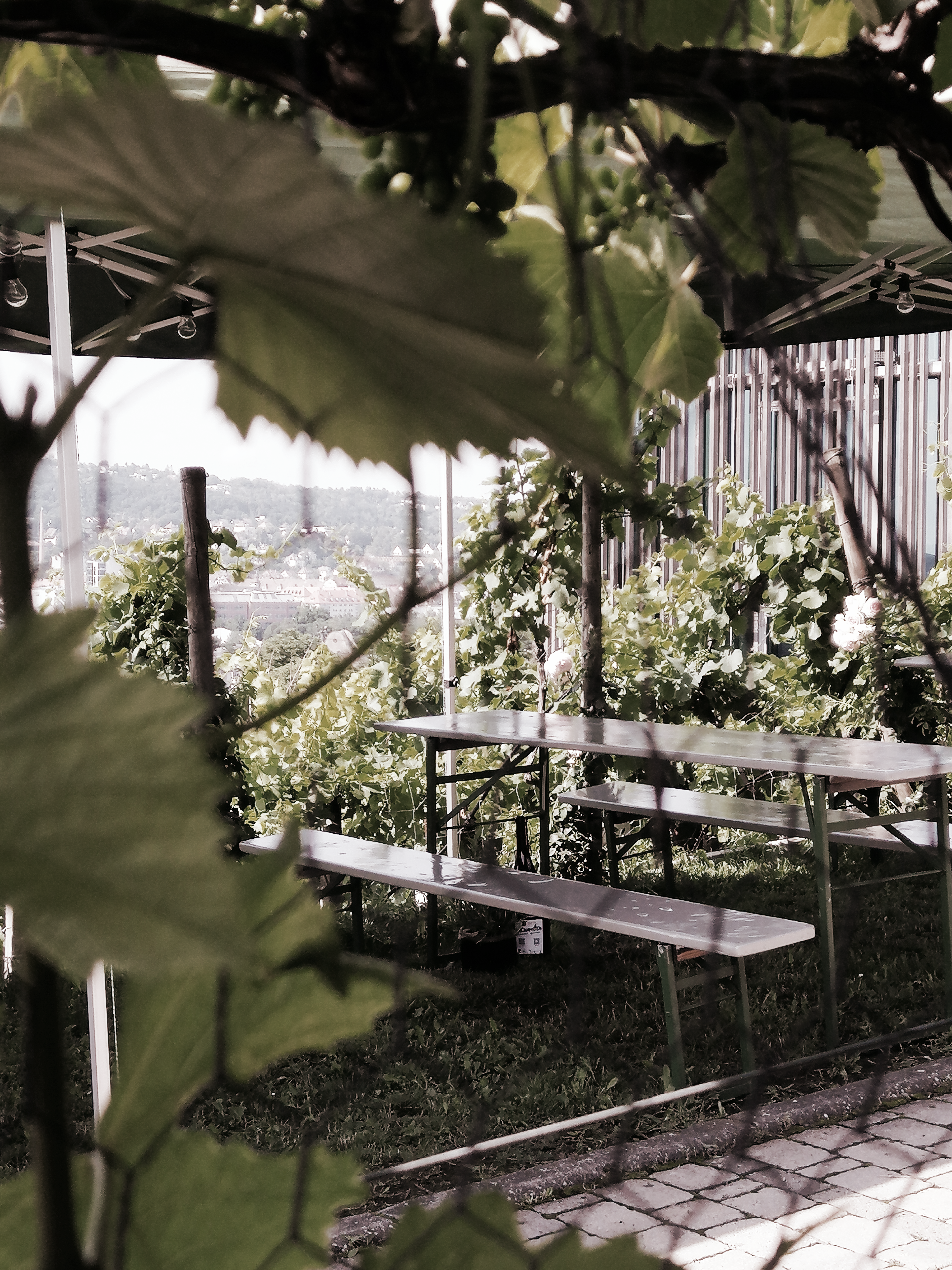
Reblust is a baroque Antiqua that stands for firmness and openess. It’s inspired by the wine city of Würzburg and combines wine, festivals and architecture. The famous vineyard Weingut am Stein in Würzburg provided the most inspiration. It’s characterized by modern buildings in combination with original houses, old bulging barrels and fine vines. Once a year the most famous and chic wine festival takes place there. There is an intensive meeting between people who love the wine culture, music and a high-quality atmosphere.
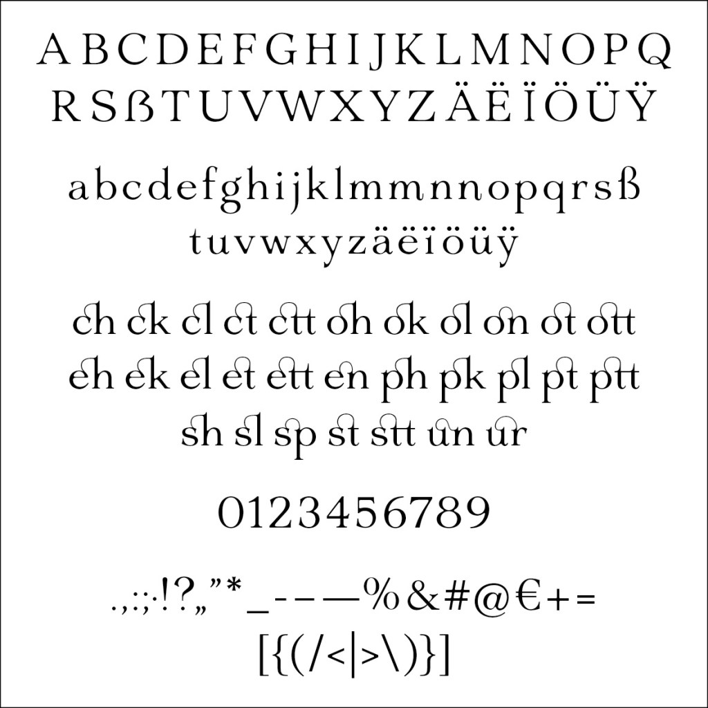
Reblust: the whole typesetting developed in one semester
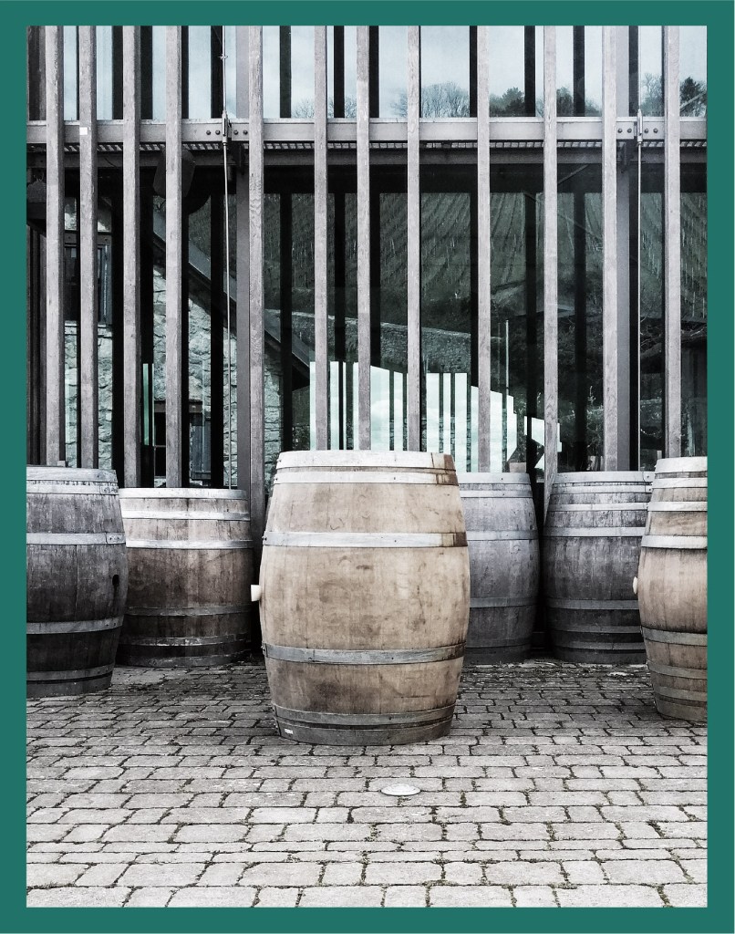
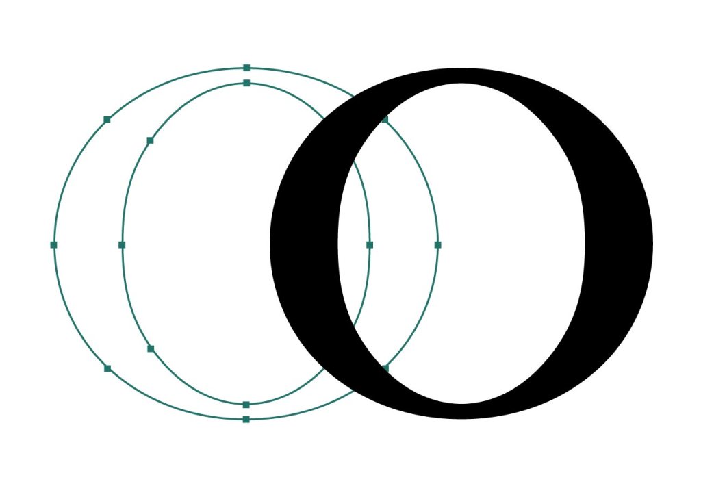
Starting: The most font designs start with the letter “o”. It is inspired by the round shape of the old barrels’ topview. The contrast between the line thicknesses corresponds to the contrast between the fine lines of the vines and the roughness of winemaking and the massive new buildings.
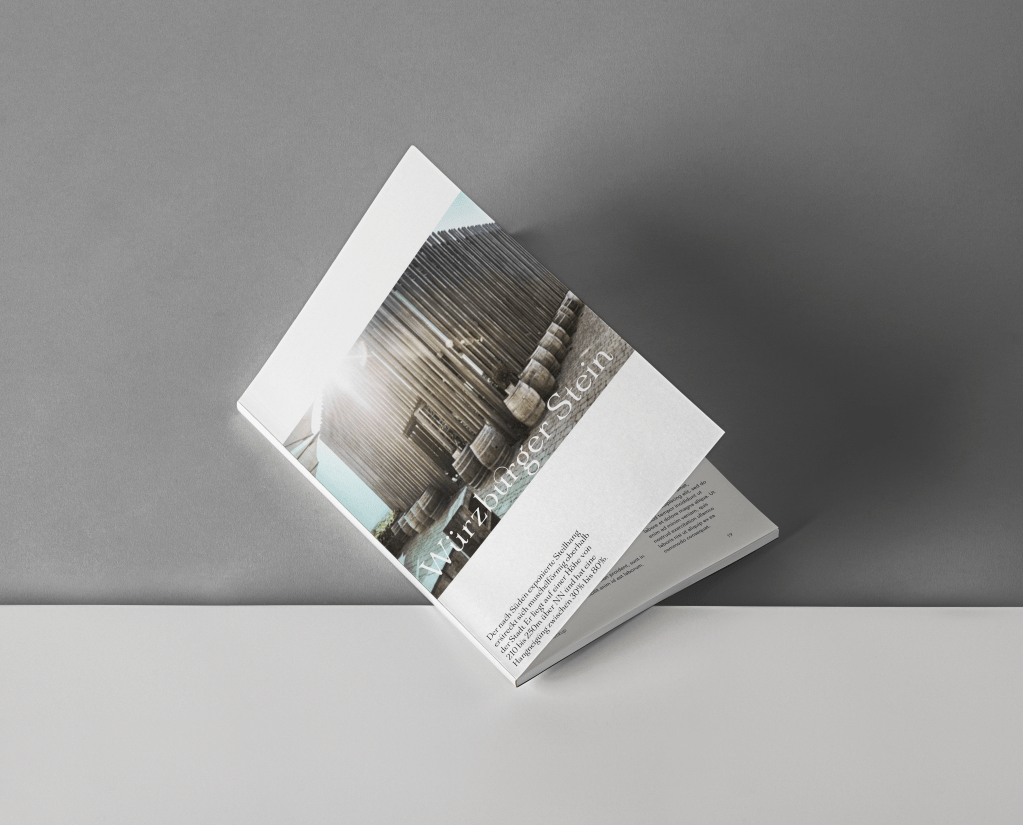
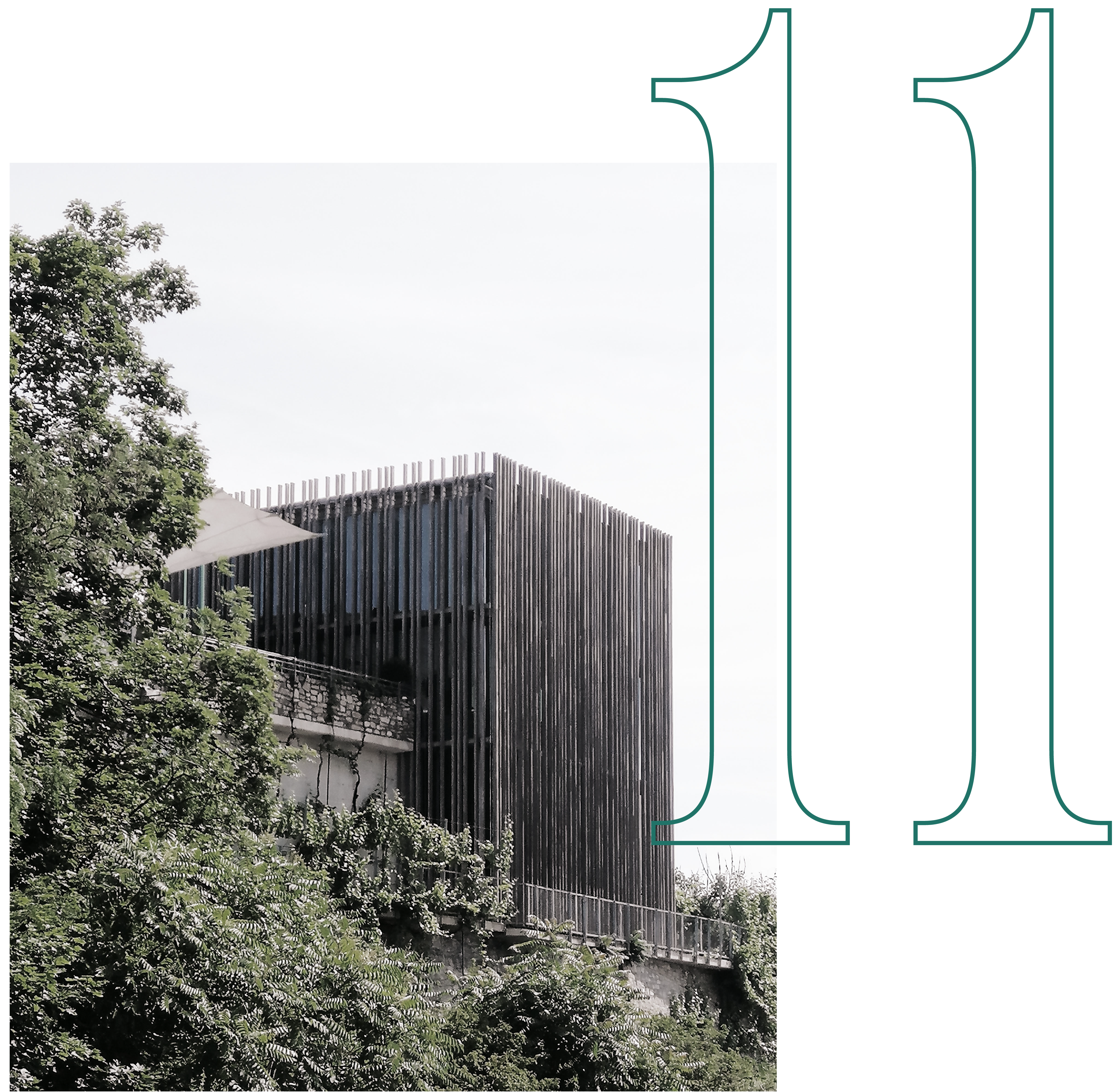
Upper length: The high upper length reminds of the characteristic building WeinWerk that is shown on the picture above and below.

WeinWerk: The architecture of that building is massive and fine at the same time. It is a transparent cube encased with wooden poles.
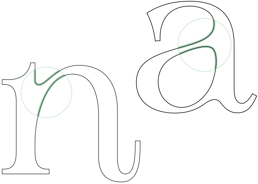
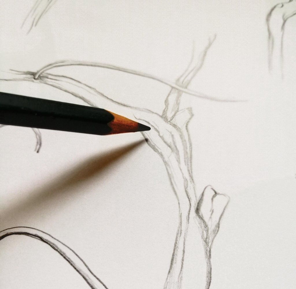
Transitions: The uneven growth of the vines was model for the transition, e.g., at the counter of the a. The harmonic transition needed a lot of sketches.
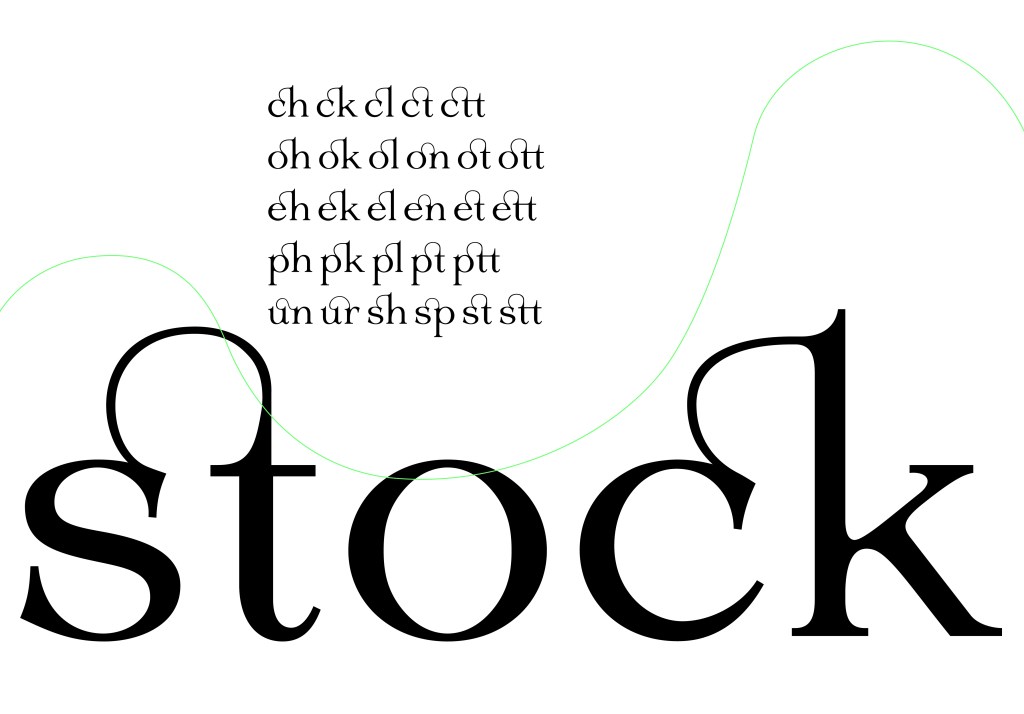
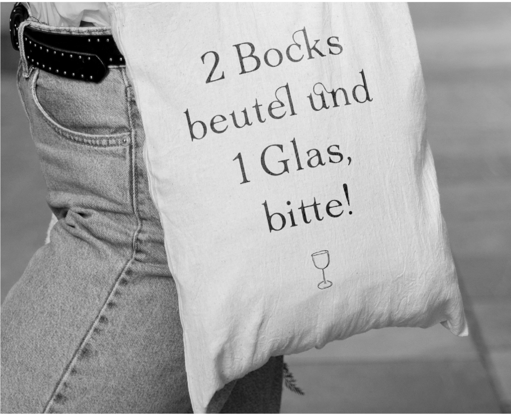
Ligatures: The ligatures represent the many shapes of the vines’ ramifications, the connection and the get-together of the wine festival’s visitors.
Numbers: The numbers were designed analogously to the letters.

Details: The font details are marked above.
